

One of the tools that I always recommend to customers is the Easy WP Guide. It is a well written, free manual on how to use WordPress. Check it out, the Easy WP Guide is for everyone!
New Favorite Tool
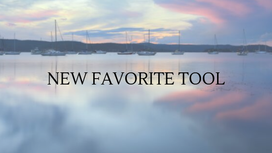
Have you heard about Canva? A non-techie friend told me about this a while ago, but I hadn’t checked it out until recently. And now it is my new favorite tool!
For graphic design, I normally use the excellent (and free) paint.net, or Photoshop for more complicated projects. Both tools are great, but I’ve found that neither are quick. Canva, on the other hand, is a very, very easy tool.
Start by creating a free Canva account. You can always upgrade later to the Pro version, but the free version is quite powerful. Next, choose a design. The designs are organized generally by size, but labeled as Facebook Post, Brochure, Invitation, Flyer, etc. Hover over each design name to check the dimensions of the project. The pro version of Canva allows you to resize your project, but the free version does not (at least not that I’m aware of), so it is important to choose the correct design (and therefore project size) first. The social media designs are perfectly sized for posting to Instragram, Facebook, etc.
After a design is chosen, Canva displays many templates to choose from. Some of the templates are free (hover over the template and look for the word Free in the lower right). After choosing the template, you can change the photos, text, background, and more. You can also upload your own photos. When everything looks good, download the project and use it however you wish.
Font matters
I like to take my time when I design a site for a customer. It is often the first impression a company makes on potential clients, so it is very important to get this right. What does my customer want to emphasize in that first impression, that first few seconds of introduction? Content is king of course, but colors, layout, UI, consistency, ease of use, responsiveness: all help to deliver your message. In my experience, even the font choice is important. Have you ever visited a site with 3 or more fonts on the same page? Or fonts that don’t work well together? You may have just noticed that it was hard to read, or seemed jarring.
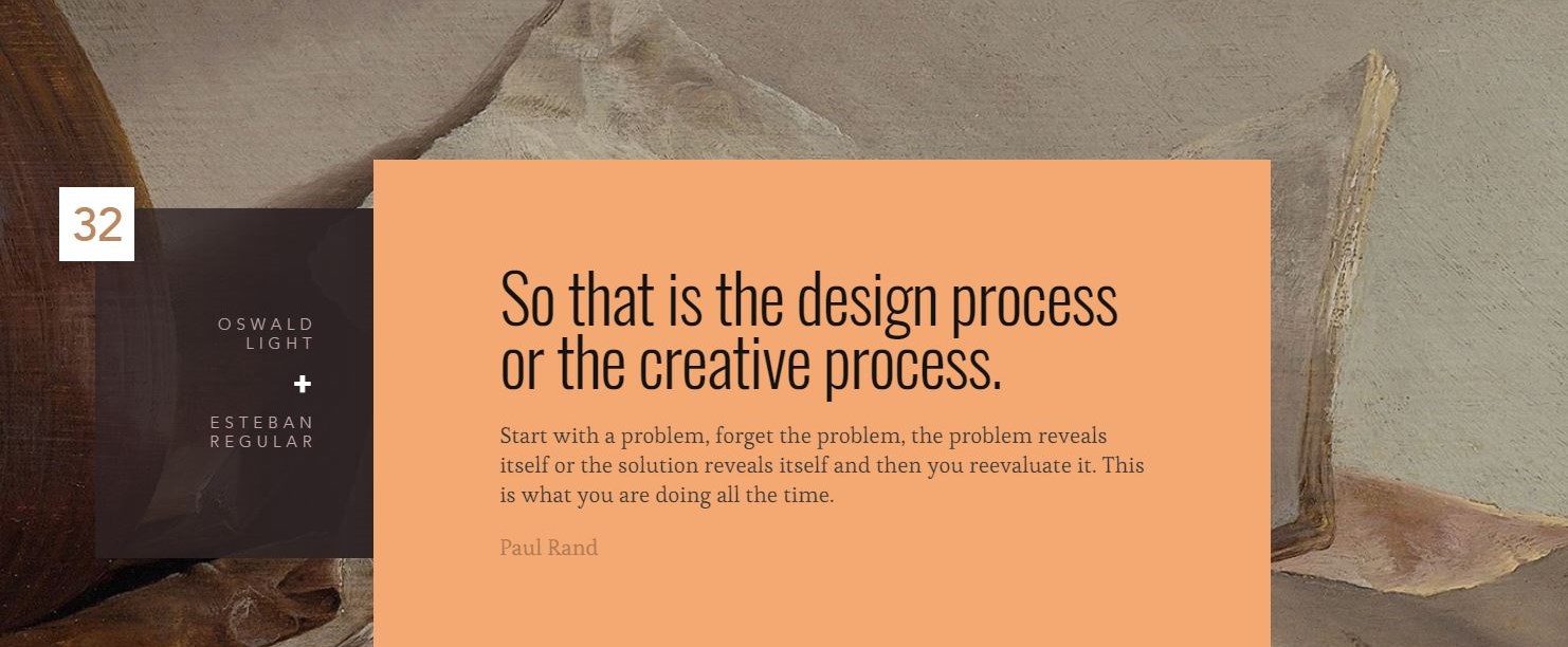
To that end, I came across this absolute gem, a site that pairs Google fonts. Check it out, it is not just useful, but it is also beautiful: The Ultimate Collection of Google Font Pairings from a company called Reliable PSD. There are 50 google font pairings, presented with a quote about design, and gorgeous images from The Rijks Museum’s online art collection. I will be adding this to my design resource toolkit.
Would hate to be this guy
Most people were affected by, or at least heard about the large internet outage earlier this week. It almost felt like half of the internet was broken, with sites like Netflix, Pinterest, and Spotify out of the water. Read about it here. I noticed it when trying to use Lynda.com. The cause was an outage at Amazon Web Services (AWS) S3 storage. Unless you are in IT, you may not have realized that Amazon does more than just offer a huge marketplace. They also have cloud services, which powers many, many websites. I’ve used AWS. It is an excellent service and I highly recommend it.
I cringed though when I heard the root cause. Some poor engineer accidentally entered the wrong command, which brought down way too many servers, much more than intended. Human errors like this are the subject of nightmares for those of us that build and care for websites. It happens to everyone, but boy, nothing like having your mistake be so public!
Smart phone privacy
This is good advice for everyone:
The Power of CSS
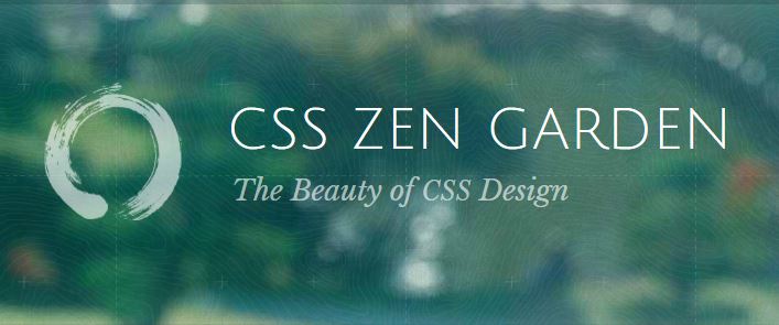
This is one of my favorites: CSS Zen Garden
With the same content, the look and feel of a site completely changes through the use of different cascading style sheets (CSS). Take a look at a few, and you’ll see what I mean. CSS is powerful.